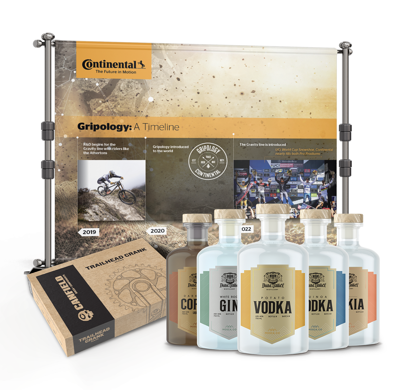


Packaging Design & Logo Update
Canfield Bikes + Components is a rider-owned mountain bike company out of central Colorado, known for building aggressive, high-performance frames with a loyal following. Their existing logo needed a refresh — it was time for something more solid, better legibility, more visual weight, and typography that could actually live on a bike frame. The updated logo brought the brand's signature "skully" icon into the primary mark, anchoring the whole thing and giving it the character it was missing.
From there, the project expanded into packaging for the new Trailhead Crank series — a one-color design using black ink on natural cardboard, working within a pre-existing box size. Bold linework and tight typography filled the space with intention, and the result was tactile, confident packaging that held its own on a shop shelf next to competing — and often larger — brands.